SFW-24
What Monday.com and Bitrix24 get wrong, and a project dashboard that tries to fix it.
- Team
- Rabiya Bhat, Manasvi Rastogi, Debdatta Maitra, Udit Joshi, Tanishka Tyagi
- Tools
- Figma, FigJam, Miro, Maze
- Methods
- Dashboard design, Heuristic evaluation, SWOT analysis, Usability testing
Overview
SFW-24 began as a class assignment in interaction design: evaluate two established platforms, Monday.com and Bitrix24, then design something better. Rather than redesign from taste, the team first studied who these tools serve and how CRMs and their integrations actually work.
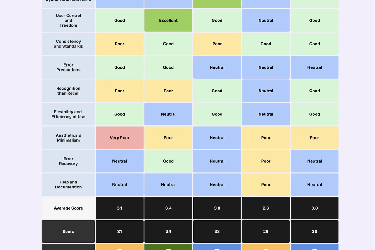
Five key screens on each platform were scored against Jakob Nielsen’s ten heuristics, producing severity ratings of 2.2 for Monday.com and 1.6 for Bitrix24, with a recommendation for each screen. A SWOT analysis covered the strategic side, while observation, first-click tests and tree testing with 20 participants measured how people really coped: task success averaged just 33.25%.
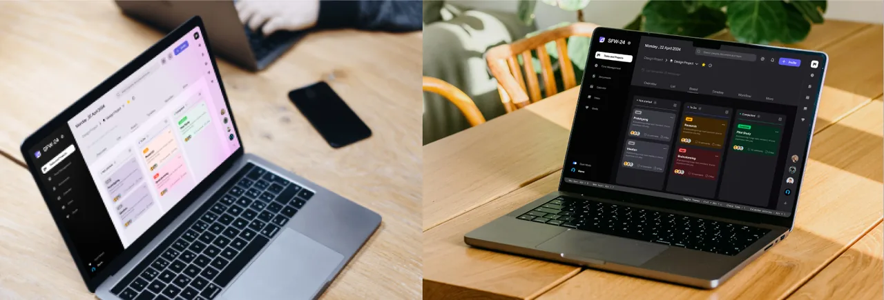
The team then made a deliberate call to narrow the scope to project management and leave sales and business features out. The result is a focused dashboard concept with a visual system in light and dark themes, built to answer the clutter and missing feedback found in testing.
The problem
Big CRM tools pack so much in that everyday project work gets harder. This began as a class assignment to evaluate Monday.com and Bitrix24, then design something better.
- 33.25%average task success on the existing interfaces
- 20participants in testing
- 2.2heuristic severity score for Monday.com
- 1.6heuristic severity score for Bitrix24
How it moved
Understanding the tools
The work started by using both platforms and learning who they serve: small businesses, startups, service companies and creative agencies.
Scoring the interfaces
Five key screens were rated against Jakob Nielsen’s ten heuristics, with a severity score and a recommendation for each, alongside a SWOT analysis of both products.
Finding the gaps
Observation, first-click tests and tree testing showed task success well below acceptable accessibility margins.
Narrowing the scope
The redesign stayed on project management and left sales and business features out, so the concept could solve one job properly.
What the research changed
- Task success of 33.25% showed the size of the problem better than any opinion could.
- Home screens were the weak point: cluttered, and more an entry point than a useful hub.
- Both products were strong on features and weak on minimalism and recall.
- Choosing what to leave out was the most important design decision of the project.
What came out of it
- SFW-24, a task and project dashboard concept in light and dark themes.
- Boards organised by status, with clear progress on each card.
- A simplified layout that answers the clutter found in testing.