Itiner
A travel app built around one question: you reached your destination, so why do you feel lost?
- Tools
- Figma, Maze, Miro, Google Forms
- Methods
- Mobile app, UX research, Journey mapping, Usability testing
Overview
Itiner began with a question most travel apps skip: you reached your destination, so why do you feel lost? The Figma case study follows Nisha, a first-time international traveller planning Dubai, through a trip that goes wrong one scene at a time. Contradictory advice leads to decision fatigue, a missed sunrise trek, a turned-away temple visit, and a booking error that leaves her paying for an overpriced villa.
The market was growing fast, with 26.9 million Indians travelling abroad and online travel worth $667.55 billion in 2023, yet Klook, Booking.com, MakeMyTrip and Expedia all compete on flexibility. That leaves a traveller with many options and no route through them. Building a real itinerary by hand showed where it breaks: documents, a scattered plan, and advice that is hard to trust in an unfamiliar place.
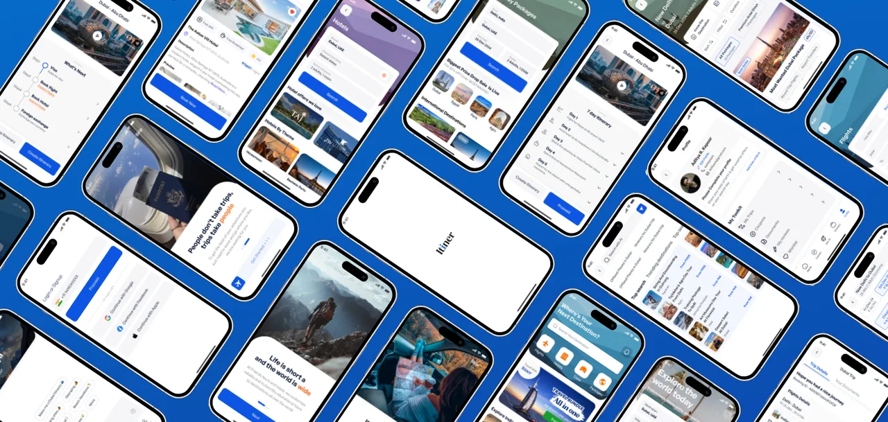
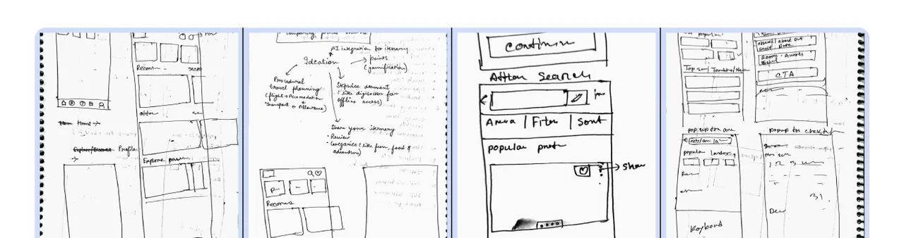
A survey of 33 people and 8 informal interviews tested the early ideas. One of them, a gamified experience, was dropped as unnecessarily complex and replaced with shared and AI-generated itineraries. The final app, built around a clear visual system in ultramarine, orange and midnight, brings booking, planning and documents into one calm journey.
The problem
Tourists struggle to find reliable, up-to-date information about a new place, then lose hours comparing options across apps. The result is decision fatigue, missed plans and trips that disappoint.
- 38pages visited on average before booking travel
- 42%of travellers find booking harder than the trip itself
- 95%of people surveyed said reviews shape their decision
- 63%of people surveyed ask friends for recommendations
How it moved
Living the problem
The project began by building an itinerary by hand. Documents were tedious to track, the plan was scattered across the journey, and advice about unfamiliar places was hard to trust.
Reading the market
Klook, Booking.com, MakeMyTrip and Expedia all sell flexibility rather than a guided route, which leaves people with too many choices. Most also had no AI help for planning.
Testing the assumptions
A survey of 33 people and 8 informal interviews confirmed it. Planning was the hard part, and some people had already started asking AI to do it for them.
Throwing out an idea
Early ideas included challenges and a gamified experience. Research showed that was unnecessarily complex, so it gave way to sharing itineraries and generating them with AI.
What the research changed
- Planning, not booking, was the real pain: people described it as difficult and time-consuming.
- Trust travels through people: 63% ask friends and 95% say reviews matter, so sharing became a feature.
- Some users were already asking AI to build itineraries, which validated an AI guide.
- Researching the ideas exposed a miss: the team had drifted away from itinerary building itself.
What the app does
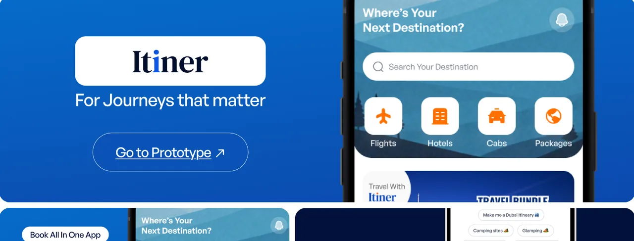
- Flights, hotels, cabs and travel packages booked in one place.
- An AI guide that drafts an itinerary from a simple request.
- A clear list of upcoming and completed trips.
- Visas, bookings and other documents kept together for the journey.