Indian Railways
Getting a ticket at a crowded station shouldn’t mean missing the train.
- Team
- Rabiya Bhat, Manasvi Rastogi, Debdatta Maitra, Udit Joshi, Kamrul Hasan
- Tools
- Figma, FigJam, Google Forms
- Methods
- Service design, Field research, Information architecture, Personas
Overview
Indian Railways is often called the backbone of the Indian economy, so the project began with a wall of sticky notes covering the whole experience, from ticketing and food to cleanliness and punctuality. Following a six-stage design process, a class discussion reduced that to nine problem areas, and voting pointed to the most severe: platform ticketing and navigating the service.
The research went beyond a desk. A survey sat alongside secondary research, and the team went to stations to speak with a station master, a coach superintendent, a travelling ticket examiner and passengers. Those conversations surfaced things no survey would: one examiner responsible for 72 passengers, attendants paying for lost items from their own wages, and passengers who simply aren’t aware of the online process.
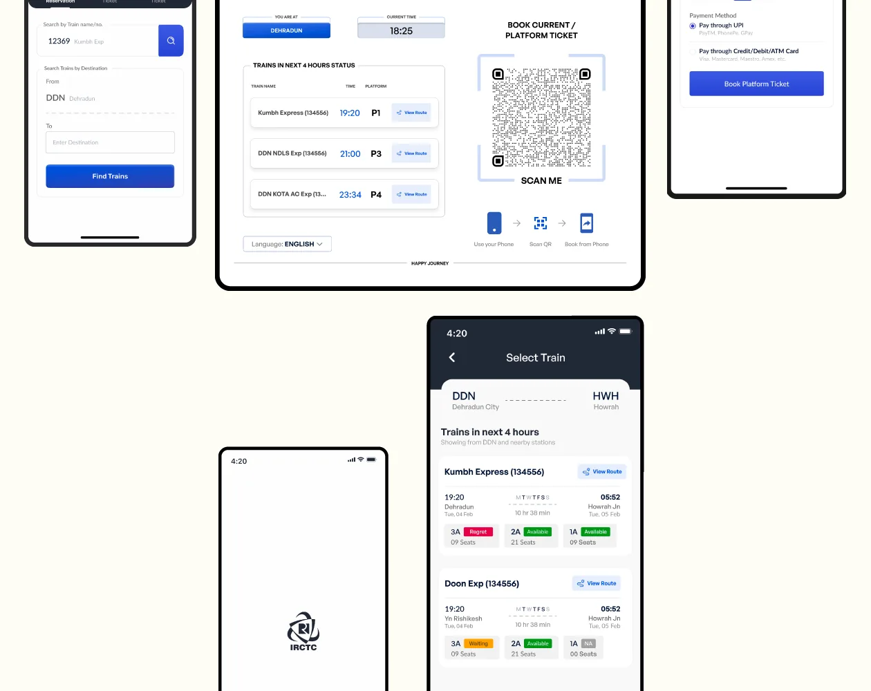
A frequent traveller’s persona, empathy map and journey map turned this into eight pain points, and the problem was redefined around one moment: counters placed outside the station, long queues, and a long walk to the platform with luggage. After weighing an AI assistant, the team chose QR kiosks at entrances and platforms that open a web app, with nothing to install and no counter to find.
The problem
Reservation counters often sit outside the station, so passengers face long queues, too few staff and a long walk to the platform, usually with heavy luggage. People miss trains because of it.
- 75%of respondents prefer booking online over the counter
- 81.25%don’t trust the reliability of the train schedule
- 49%rely on station displays for train status
- 2 in 5have seen someone unreserved take their seat
How it moved
Nine problem areas
A wall of sticky notes and a class discussion narrowed railway travel down to nine problem areas. Platform ticketing and finding your way around the service were voted the most severe.
Going to the station
The team interviewed a station master, a coach superintendent, a travelling ticket examiner and passengers. One finding stood out: staff described a rule differently from the official documentation.
Mapping one passenger
A persona, empathy map and journey map followed one frequent traveller from planning to arrival. That surfaced eight pain points, from raising complaints to last-minute platform changes.
Reframing the problem
The first problem statement was broad. Field research narrowed it to the moment that hurts most: reaching a counter in time, in a crowd, with your bags.
What the research changed
- 75% already prefer booking online, yet the counter queue remains, so the gap is access at the station.
- 81.25% don’t trust the schedule, which made live information on trains leaving soon a priority.
- Staff and official documents disagreed on the two-stop rule, showing confusion runs through the whole system.
- A six-step counter journey could become a scan, a choice and a ticket.

What the team proposed
- QR kiosks at station entrances and platforms, so nobody has to find a counter.
- A web app that opens from the scan, with nothing to install.
- Platform tickets, current reservations and chart vacancy in one flow.
- A view of trains leaving in the next four hours, with vacant berths.